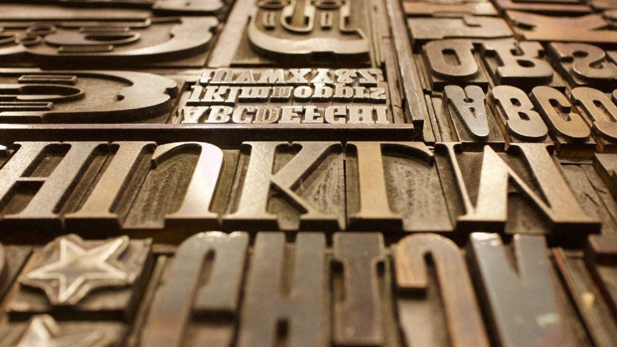
We asked 5 web designers to tell us what fonts will be big in 2021
Words by: Charlotte Alice Moore
All good designers understand the role that typography plays in creating an interesting and unique site.
But, with trends shifting so quickly, we grilled five designers to get their predictions across the industry for 2021.
Scott Jones, managing director of Illustrate Digital
For me, it’s all about clean, semi-bold and sans-serif fonts in 2021.
Just take a look at some of the logo changes for some of the world’s biggest digital brands: Airbnb, Facebook, Microsoft. They’ve all made (let’s be honest, pretty similar) typeface and colour choices that make their brand name easier to read.
Why? Because digital is undoubtedly more important than it’s ever been and so the clarity and usability of brand logos and fonts on websites are more important as a result.
We should expect to see a lot more rounded fonts with clean lines and a much greater focus on accessibility.
Brands should be lowering their barrier to entry for digital experiences as much as possible. To make websites and software available and easy-to-use for as many people as possible.
Ultimately, if your users struggle to read your content or interact with your experience, you lose out when benchmarked against you the new industry standard.
Ruby Lee, founder and creative director of Studio 77
Your font choices are so important, on and offline. Typography says a lot about your brand and your message, and can even convey the tone of voice that you’re using with your fonts.
Whilst making sure your website fonts are readable is paramount, I like to use fonts with a bit more character for the headings.
For example, for an editorial brand I recently worked with I used a romantic serif font called Roxborough, as it matched the tone of the voice that we were trying to portray.
I must stress, you should only use these beautiful fonts at a larger point size on headings, otherwise, you’re going to make it very difficult for people to read your body copy.
I’m a firm believer that your body copy should always be a clean and simple sans-serif font on the web, you really can’t go wrong with something like Proxima Nova or Open Sans.
Emma Armstrong, brand and Squarespace designer at Curate Your Curious
2021 is all about connection, sustainability and nostalgia. So, we’re seeing a move away from standard serifs and san serifs to fonts that create more emotion and connection.
Think bold retro fonts, sleek classical fonts and playful fonts. Fonts like Bely, Glamour Absolute and Apparel that play with angles and widths to create something different.
Experimentation is the aim of the game, putting a twist on an old favourite. But trends are trends, so make sure that any font you choose aligns with your business and offer and don’t forget it has to be legible.
Allison Valiquette, creative producer at AllisonValiquette.com
Web design is swiftly starting to emulate the retro and “vintage” trend that has dominated much of visual culture over the past few years.
While Gen X has spearheaded the resurgence of 90s trends, fervour for the comfort that nostalgia offers has given way to lots of explorations of vintage-inspired design this extends to web fonts, with Google Fonts continuing to add new decorative web-safe fonts that lend themselves to the retro trend.
It’s a really beautiful and creative time for web design that web fonts can be this custom and inspired, but it does raise pause for accessibility concerns.
The more decorative, the more visually complex, and this could be really detrimental for a vision-impaired user. Have fun with the trend but remember that usability should always come first.
Bethany Fulton, creative director and founder of Brambles Branding
Nostalgia and retro are the driving forces as we plunge deeper into the murky quagmire of 2021.
We’re looking to the positivity of the past to distract from the present, and this is reflected in current design trends. The 90s is seeing a resurgence with fonts like Thunderstorm, Bayshore and Alkaria (which I’m sure I had on a t-shirt reading ‘Angel’ back in the day) becoming popular.
Distorted fonts such as Plastic Sans and Okurrr are also proving popular, but these can be difficult for those with reading difficulties to understand. For this reason, distorted fonts are generally sans serif to reduce legibility issues.
There will be a real divergence in styles as designers either focus on aesthetics or accessibility - the key for good designers is to incorporate a little bit of both.
Want to make sure your own use of fonts gets noticed?
Ensure your hosting is up to scratch. Check out our powerful webhosting options.
,


